More threads by Drew

Drew

Member
Hi everyone, I could really use your help, guidance and input on this topic, so I'll go ahead and send out a hearty "THANKS!" in advance to encourage participation. :wave4:
And please, don't assume that you need to have 'an eye' for art to participate - more than anything else, I'd like to choose appropriate pieces that people will enjoy without being too distracting or 'statement-making.'

I'm looking to buy a few art posters for my small office to add some greatly needed color, character and something nice and pleasant to look at. These posters will be going on the walls in my small office space (roughly 10 x 12). This is for my dayjob as a school social worker in a large, urban public middle school (grades 6-8, ages 11-15...yea, only 15 if you've repeated a time or two, hehe). The walls are painted light blue, and the general vibe is doom-n-gloom aplenty with no natural light whatsoever. :lol: I have a large floorlamp in the back corner providing some warmth to the room, and I'd like to get a few art posters with some color to add some additional color, warmth and something-nice-to-look-at for all the kids who come to my office.

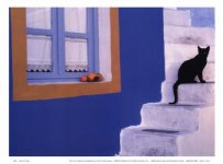
Today, I poked around a local art supply store to see what kinds of art posters they carried. One I put aside as a contender was this one below:

2ASRF00Z.jpg


I thought it would do a great job of adding color and life to the room, but ultimately, I didn't get it because I thought it might be too busy and I wasn't sure that a poster depicting night-life (as benign as it may be) would be the most appropriate image to post in a middle school.

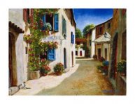
Another I put aside (and ultimately didn't get) was this one below:

clear.gif

I liked the colors, I liked the guitars and thought that kids would dig it, but I felt the guitars were a bit presumptuous, and that I should be targeting images depicting more universal subjects or scenes.

Finally, the last one I put aside (and yet again, didn't get) was this one:

clear.gif


I thought this one did a great job of being a natural, universal image depicting warmth, relaxation and perhaps even hope, but it wasn't the most colorful image (not that that's a bad thing), and I'd totally lost my momentum and faith in myself to make a good choice at this point, so I put it back and escaped to run a few easier (read: less decision required) errands. :lol:

One thing I've been thinking about is size - should I go for 2-3 large art posters, or a higher number of smaller art posters? I can think of pros and cons for each.

I'd love to hear some of your thoughts, tips or ideas for some wall posters/images I can hang in my counseling office to bring some life, warmth and comfort to the kids who come by. Feel free to link/post images to specific suggestions - there are tons available between sites like art.com and allposters.com.

Thanks again!
 
Re: posters/art for office?

I like the tree the best because it just looks so calm and peaceful, but i'm old. LOL. The guitars are my second favorite. The first one kind of freaks me out. :eek:mg:

I like the big art in my therapist's office. It gives me something to drift away into, BUT that probably isn't what i'm supposed to be doing. :eek:
 

David Baxter PhD

Late Founder
Re: Posters/Art for therapist's office?

I agree that the first one looks rather foreboding and dangerous, so possibly not a good idea. The other two are fine.

I probably should take a critical look at what I have in my office too. :)
 
I actually would've gone the opposite way, with the tree looking too lonely for my liking and the street being nice and colourful. (Well, ok, maybe it's a little busy...) The guitars are cool though... Says me with three (not so brightly coloured) guitars in my room...
 

AmZ

Member
I actually would've gone the opposite way, with the tree looking too lonely for my liking ...

Ahh! You took the words right out of my mouth! I looked at that tree and straight away, it made me feel lonely and think that it really invokes that, whether you are lonely or not (?). I think so anyway.

I'd personally go for abstract (much less chance of being 'offensive' in some way) and colourful. Something that doesn't depict anything physical like vast landscapes or cities, objects, or any other 'subject'.

This is coming from someone that studied Fine Art and that has a personal insight in to mental health issues also!

You can just go for colour/s instead and focus on that, as you can't really go 'wrong' with it as colours make most people feel the same, i.e. red for love and passion, but also could be hatred, anger and pain, and all the rest of it! Maybe these would look good on a light blue wall?

Yellow is a good calming and hopeful colour - Yellow and Gold

clear.gif


There are loads of these like above, by Mark Rothko in all different colours.

Or you can go with a 'cheery' mix of colours. Circles are good also. They represent wholeness, completion, continuation, etc. - Life Is a Beach II (LOL, couldn't help but laugh at the title. Life certainly a b... bi... bitc... beach, YES!)

clear.gif


That's my personal opinion! Good luck.
 

Drew

Member
I like the tree the best because it just looks so calm and peaceful, but i'm old. LOL. The guitars are my second favorite. The first one kind of freaks me out. :eek:mg:

I like the big art in my therapist's office. It gives me something to drift away into, BUT that probably isn't what i'm supposed to be doing. :eek:
I never considered the 'freak out factor' of the nighttime Soho scene, but after you and Dr. B mention it, I can totally see/feel that from one perspective! :shock4:

Here are some I like. :D

I like lots of these:

Autumn prints and posters at ArtFilledLiving.com
I love the colors in the blue wall/cat and the European city street images. Thanks for sharing those.

Ahh! You took the words right out of my mouth! I looked at that tree and straight away, it made me feel lonely and think that it really invokes that, whether you are lonely or not (?). I think so anyway.

I'd personally go for abstract (much less chance of being 'offensive' in some way) and colourful. Something that doesn't depict anything physical like vast landscapes or cities, objects, or any other 'subject'.

This is coming from someone that studied Fine Art and that has a personal insight in to mental health issues also!

You can just go for colour/s instead and focus on that, as you can't really go 'wrong' with it as colours make most people feel the same, i.e. red for love and passion, but also could be hatred, anger and pain, and all the rest of it! Maybe these would look good on a light blue wall?

Yellow is a good calming and hopeful colour - Yellow and Gold

clear.gif


There are loads of these like above, by Mark Rothko in all different colours.

Or you can go with a 'cheery' mix of colours. Circles are good also. They represent wholeness, completion, continuation, etc. - Life Is a Beach II (LOL, couldn't help but laugh at the title. Life certainly a b... bi... bitc... beach, YES!)

clear.gif


That's my personal opinion! Good luck.
Wonderful post, AmZ - so helpful and informative - thank you so much!

You make wonderful points regarding color, shape and how abstract images are great for invoking feelings or moods without the baggage that images of people, places and things can bring. I'm really fortunate to have your trained eye and informed input here. :thankyou2:

I'm now looking through the Mark Rothko and Mary Calkins pieces you linked. AmZ, what are your thoughts regarding poster size? My office is roughly 10x12. Do you have any opinion regarding if it would be better to get a small number of large-ish posters (1 each wall), or, a slightly greater number of smallish posters? :confused:

I think it would be interesting for the kids if you took your own pictures and had them blown up. Maybe?
Neat idea!
I recently got a smartphone, so maybe I should start putting its camera to good use.
 

CarlaMarie

Member
Drew I have an opinion pased on my experience in many offices of many therapist. I am opinionated and I have been told I can be bossy especially when it comes to decorating. The number of prints depends on the size of the prints and the size of the wall you are trying to fill. Yes warm, yes inviting and get something that inspires you so that when clients come in they can get an idea of who you are. I like that in a therapist. I like to get a perception of who they are through my senses if you know what I mean. But I am a chick who is about art and color and texture and all that. I use all my senses and I can remember every psychologist, psychiatrist, therapist, counselors office I have ever been in. That is my opinion.
 
I like the first picture very much it was more alive feeling more intriguing in that it took me places in my mind it made me not feel so alone just me though the tree made me feel very alone.
 

AmZ

Member
Wonderful post, AmZ - so helpful and informative - thank you so much!
You make wonderful points regarding color, shape and how abstract images are great for invoking feelings or moods without the baggage that images of people, places and things can bring. I'm really fortunate to have your trained eye and informed input here. :thankyou2:
I'm now looking through the Mark Rothko and Mary Calkins pieces you linked. AmZ, what are your thoughts regarding poster size? My office is roughly 10x12. Do you have any opinion regarding if it would be better to get a small number of large-ish posters (1 each wall), or, a slightly greater number of smallish posters? :confused:

You are most welcome :) And thank you for asking this question, I was enjoying looking through the posters myself! Glad to have helped.

I think that if you have 3 walls and the other with the door etc, then probably can put one poster on 2 walls. If you have one of those walls with a window and whatnot, you can also put a smaller sized poster on that wall and a larger one on the other. That's what I have in my apartment and it works - Not too overcrowded or too much which makes the room feel smaller.

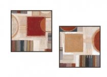
It's a shame, I was trying to find something similar to what I have at home. I have on one wall, 2 framed art prints that came in a pair. There wasn't really anything like this available on the poster sites. A few, but the sets were in 4's and 6's mainly so not good for a smaller room.

q.jpg

This is what I was thinking, which is kind of similar to what I have and I personally like. I have them set out like this also and mixes things up a bit, less 'formal' feeling, rather than have one poster sitting there by itself.

But don't think it's such a big deal! I think nice modern colorful prints in a nice pine colored frame look great. Probably medium (to large) is best with the two posters differing in dimensions as each other.

Let us know how it goes!

Good luck!
 

Yuray

Member
Because you know the specific age group of the kids, they should probably be the best judge of what pictures to hang. Have a contest. Get some feedback from the kids who have to look at them while in your office. Maybe some pictures that would inspire a career choice. We have been looking at this through the eyes of adults, and what we would like, or what we think the kids would be comfortable with. Lets ask the kids. You may also consider repainting if possible, or hang fabric.
Color Psychology, what do colors mean and represent
note what is said sbout blue, the current colour of you office.
 
Last edited:

Drew

Member
Drew I have an opinion pased on my experience in many offices of many therapist. I am opinionated and I have been told I can be bossy especially when it comes to decorating. The number of prints depends on the size of the prints and the size of the wall you are trying to fill. Yes warm, yes inviting and get something that inspires you so that when clients come in they can get an idea of who you are. I like that in a therapist. I like to get a perception of who they are through my senses if you know what I mean. But I am a chick who is about art and color and texture and all that. I use all my senses and I can remember every psychologist, psychiatrist, therapist, counselors office I have ever been in. That is my opinion.
Good points, Carla.
The dimensions of my office are roughly 10x12, and all 4 walls have space available for posters.
I work in a large, urban middle school, so I'm trying to make sure that what I hang in my room is as universal and school/age-appropriate as possible. If this was my private practice office, I would decorate it a bit differently.

I like the first picture very much it was more alive feeling more intriguing in that it took me places in my mind it made me not feel so alone just me though the tree made me feel very alone.
I can definitely see/feel that. :)

You are most welcome :) And thank you for asking this question, I was enjoying looking through the posters myself! Glad to have helped.

I think that if you have 3 walls and the other with the door etc, then probably can put one poster on 2 walls. If you have one of those walls with a window and whatnot, you can also put a smaller sized poster on that wall and a larger one on the other. That's what I have in my apartment and it works - Not too overcrowded or too much which makes the room feel smaller.

It's a shame, I was trying to find something similar to what I have at home. I have on one wall, 2 framed art prints that came in a pair. There wasn't really anything like this available on the poster sites. A few, but the sets were in 4's and 6's mainly so not good for a smaller room.

funny-pictures-cat-in-rainbow-marker-fortress.jpg

This is what I was thinking, which is kind of similar to what I have and I personally like. I have them set out like this also and mixes things up a bit, less 'formal' feeling, rather than have one poster sitting there by itself.

But don't think it's such a big deal! I think nice modern colorful prints in a nice pine colored frame look great. Probably medium (to large) is best with the two posters differing in dimensions as each other.

Let us know how it goes!

Good luck!
Excellent ideas and suggestions once again, AmZ! *HIGHFIVE*
I have no windows in my office, unfortuinately - I'm in the bowels of the school. :)
However, my office door is what I believe is called a "Dutch door" - the top half of the door can be seperated and opened independently from the bottom half, and it can be latched to the wall to be kept open. I always keep the top door open for protection and no hint of impropriety when working with the kids. The door is in the very front side corner of the room.

I really like your suggestion of possibly hanging a few smaller posters together in pairs. I have a couple coping strategy posters hanging on one wall in the room, so I have 3 other walls to work with - one wall is lengthwise/long, the other 2 walls are a bit shorter.

Another factor to take account of is that all the walls are brick/cinder block, and therefore I can't drill into it. Anything I hang in the room has to be able to be hung/attached to the wall with adhesive of some sort, so that greatly limits my options for frames. I know I can laminate the posters and get sticky tabs or tape to hang them on the walls, but I'm wondering if there's some sort of lightweight plastic or other solution/frame that I could encase the poster along with a nice border to give the effect of a border/frame when I hang it on the wall. Any ideas?

Because you know the specific age group of the kids, they should probably be the best judge of what pictures to hang. Have a contest. Get some feedback from the kids who have to look at them while in your office. Maybe some pictures that would inspire a career choice. We have been looking at this through the eyes of adults, and what we would like, or what we think the kids would be comfortable with. Lets ask the kids. You may also consider repainting if possible, or hang fabric.
Color Psychology, what do colors mean and represent
note what is said sbout blue, the current colour of you office.
Great idea, Yuray, and that would be a lot of fun, and I really like the promotion of the kids 'voice' aspect to your idea.

I already have some career-related posters and some character building/core values posters that I have posted in the hallway/waiting area around my office. I could hang one more in my office if I chose, but at the expense of an 'adding warmth/color' to my office poster.

I've done a contest with decorating my previous office in the past, and that was a lot of fun, but one thing I experienced last time is that it was difficult to obtain consensus because the kids had such differing senses for what they liked, problems with appropriateness, effect on the room, etc. My previous office was much larger, and as such was much easier to accomodate things like this - I dedicated a specific wall to kids art and chosen decorations. My office now is so small that I have to be really judicious and thoughtful about what I hang.

GREAT find on that link to the color psychology piece - saved!
 

AmZ

Member
Very welcome :)

You are sure getting some good advice here from everyone.

I know the answer for you concerning how to hang the frames, because I had the same issue. My walls are built with Jerusalem Stone and I had some issues (to say the least!) in trying to hammer nails in when I first tried to put up my frames. The nails would go in maybe 3mms and that was it! Adhesive hooks lasted about 4 days for me BTW. They don't hold weight very well.

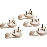
HOWEVER, I found a solution that has worked for me and will be good for you two I'm sure. Very easy and they work great. They are specifically for hardwalls. You just hammer on top of the pins and they go straight in the wall. My frames are still up and there is no budging the hooks at all! Here is what I use. Good luck.

Hardwall Picture Hangers - Use on cinderblock, cement, and hardwood.

8303406-1.jpg

Aubuchon Hardware Store Locations
Ayer Haverhill Sandwich Carver Kingston Shelburne Falls Chelmsford Littleton South Sandwich Clinton Lunenburg Southbridge Easthampton Marstons Mills Tewksbury Falmouth Maynard Turners Falls Fitchburg Middleboro Wareham Foxboro North Adams Webster Franklin Norton Whitinsville Gardner Orange Williamstown Great Barrington Plainville Greenfield Plymouth Hadley Pocasset
 
Replying is not possible. This forum is only available as an archive.
Top